ITrack comes with a few built-in Dashboard reports. You can modify the default reports, or you can make new ones.
The Dashboard consists of one or more Reports, each of which can have one or more Charts. Charts can appear on more than one report, as long as that report has all the parameters needed from all charts.
📁 Reports
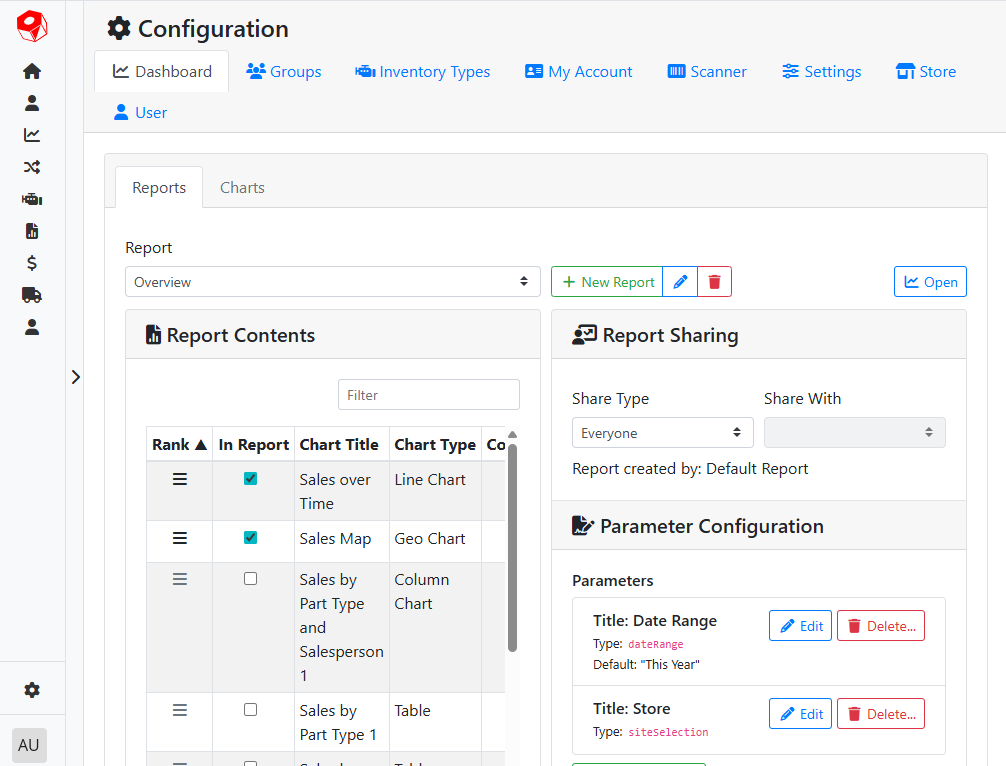
Each Report will appear in its own tab or view in the Dashboard, and can be shared across users or restricted to certain users or groups. Reports can have more than one Chart, but need to have at least one Chart to be useful.
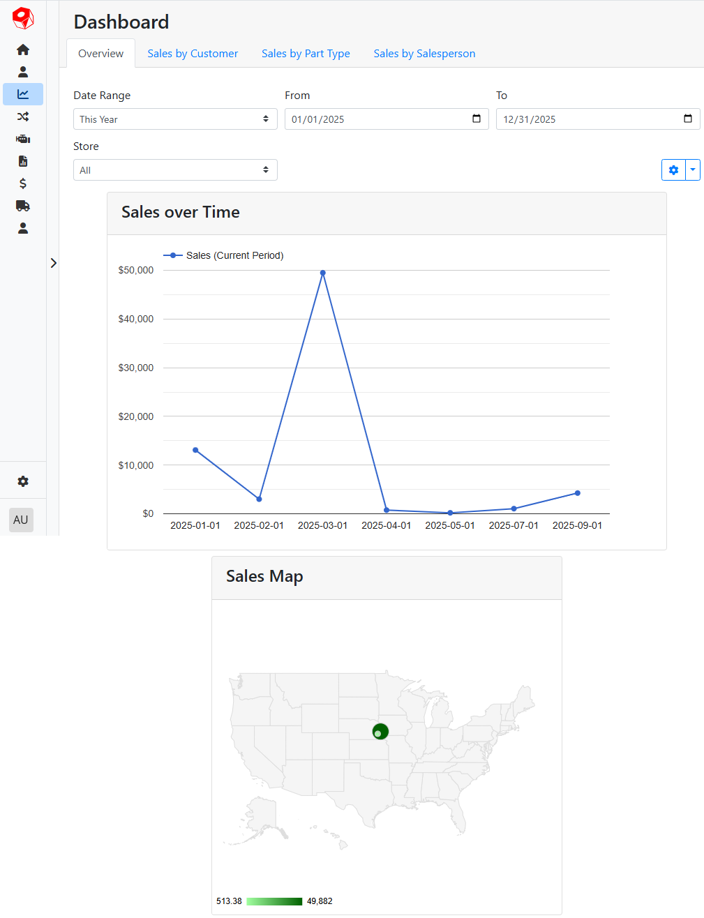
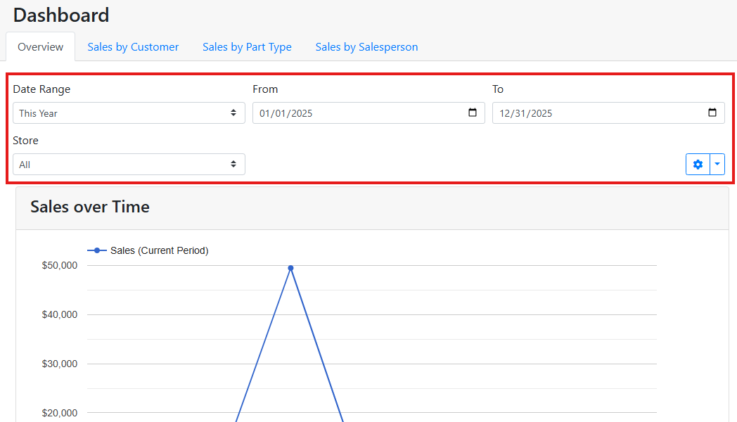
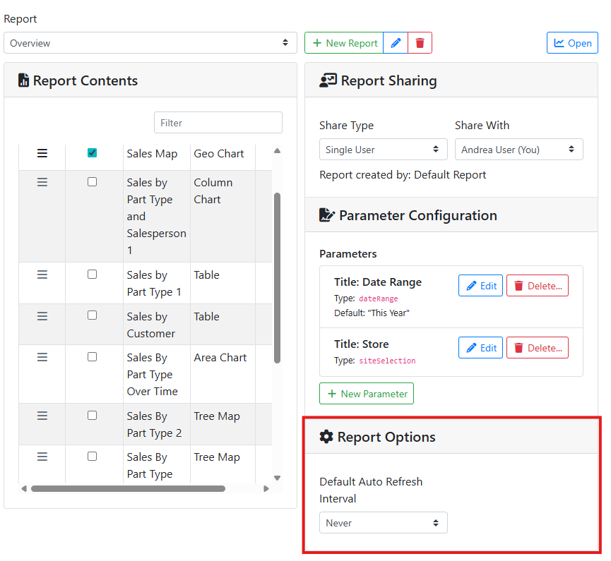
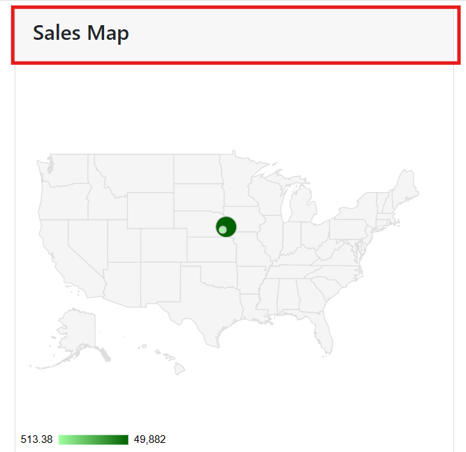
For example, the default Overview report contains two charts, Sales Over Time and Sales Map. The name of the report appears in the tabs along the top of the dashboard. Each chart appears in its own box in the report. The report has a single control for date range, which affects all charts in the report.
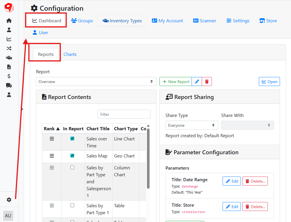
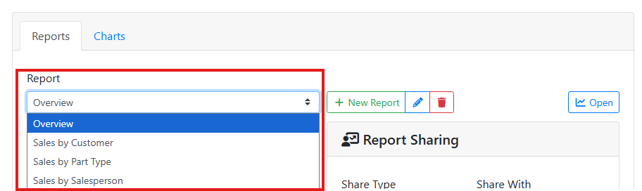
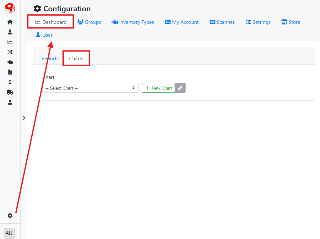
To edit an existing report or make a new one, navigate to Configuration > Dashboard > Reports.
✏️ Editing a Report
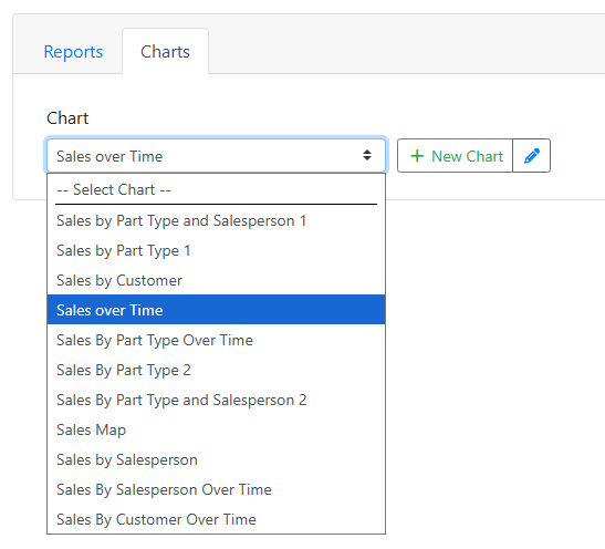
Use the drop down menu to select a report to edit.
Click the pencil icon ![]()
Click the trash icon ![]()
![]()
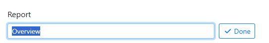
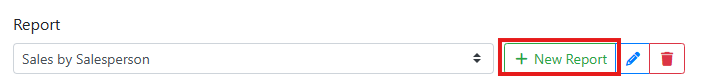
➕ Making a New Report
To make a new report, click the New Report button and give the report a name. Click Done when you are finished giving the report a name. When you are finished naming your report, you can then pick a chart to display in the report, set its sharing settings, and parameters.
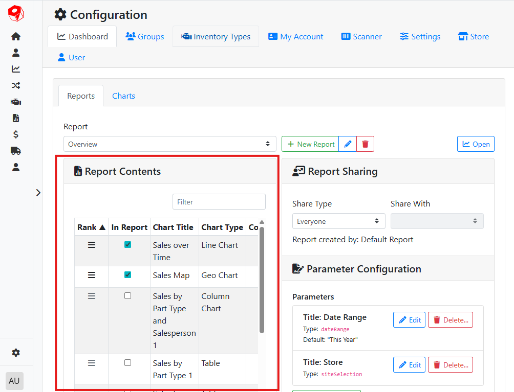
☑️ Picking Charts to Display in the Report
Use the Report Contents box to pick which chart(s) appear(s) in the report. To add a new chart, check the In Report checkbox. Adding a chart will move it to the top of the list. Once you’ve added all desired charts, use the Rank control ![]()
![]()
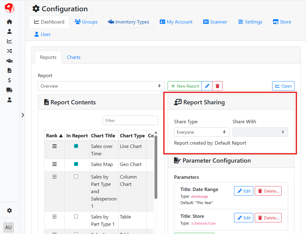
👥 Sharing a Report
Use the Report Sharing box to control who has access to this report. By default, reports are shared with everyone. Use the Share Type menu to change who has access to the report. You can share a report with Everyone, a Single User, everyone who works at a particular Store, or a user Group.
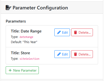
📝 Parameter Configuration
Parameters in a report let you set boundaries for your chart data. Some charts won’t load correctly unless the report has the same parameters of the chart. Make sure the report parameters you add make sense for the charts in the report.
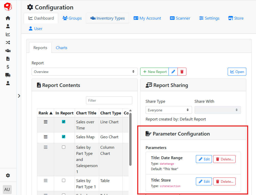
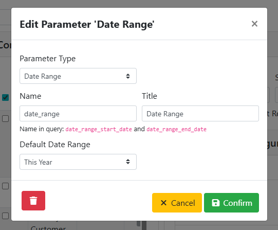
For example, a date range in a report is a type of parameter. If your report uses a date range parameter, you will see a Date Range control at the top of the report in the dashboard.
Click the New Parameter button to add a parameter. Click the Edit button to edit an existing parameter.
When adding a parameter, you will need to set a Parameter Type first. Depending on what type of parameter you are adding, the options will vary.
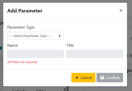
After picking a type, the Name and Title will automatically be set. If you are using a Date Range or Date parameter type, you can also pick a relevant default.
⚙️ Report Options
The Report Options box lets you set an interval for a report to automatically refresh. This setting is designed to be used if you regularly leave a dashboard report open for long periods of time. For example, you may display a dashboard report on a mounted display and want real-time updates. If this is a report you run on-demand, leave the auto-refresh interval set to Never.
📈 Charts
Charts are the component in a dashboard Report that displays the data from the report parameters. A report might have only one chart, or it could have many charts. Charts can also be reused across multiple reports.
To edit an existing chart or make a new one, navigate to Configuration > Dashboard > Charts.
✏️ Editing an Existing Chart
Use the drop down menu to select a chart to edit.
After selecting a chart, click the pencil icon ![]()
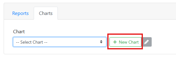
➕ Making a New Chart
Click the New Chart button to create a new chart.
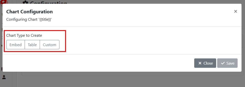
When making a new chart, you first need to pick what type of chart you are adding. After you select a chart type, you can begin modifying it.
📝 Chart Parameters
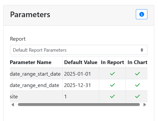
Parameters are assigned to a report so that you can set boundaries for your chart data. In order for report parameters to affect a chart, the chart also needs parameters assigned to it in the chart’s database query. The parameters on the chart must appear on the report as well, but a chart doesn’t need to use all report parameters. The Parameters box in the Chart Configuration window lets you see whether the chart will work correctly in a given report.
Use the Report menu to select a report. The table will display all parameters for the chart and the selected report, and let you confirm if the chart parameters are also in the report.
⚙️ Chart Options
The Chart Options box is available for all chart types and lets you change some basic settings on a chart.
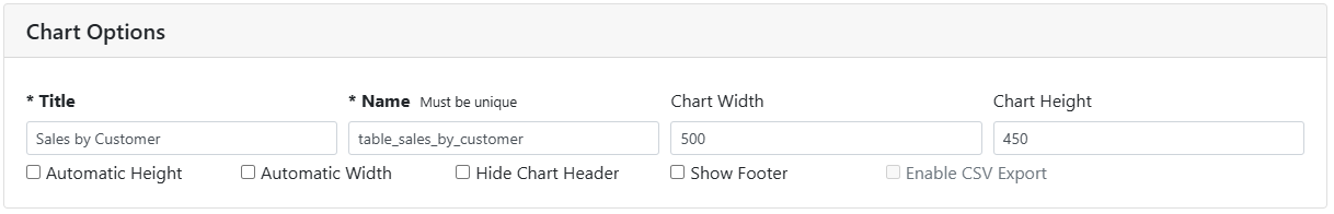
Title - The chart title is a required field, and will be used to identify the chart in menus and on the screen. The chart title will also appear in the chart header, if it is being displayed.
Name - The unique name for the chart in the database. This will be automatically assigned based on the chart title, and it’s recommended that you keep the default value. You may need to change this if it is not unique.
Chart Width - The chart’s width, in pixels.
Chart Height - The chart’s height, in pixels.
Automatic Height - When enabled, overrides the Chart Height and will try to draw the chart at the maximum height for the current screen display. Automatic Height works best in reports that only have a single chart.
Automatic Width - When enabled, overrides the Chart Width and will try to draw the chart at the maximum width for the current screen display.
Hide Chart Header - Charts display on the dashboard with a header that contains the chart Title by default. Enable this setting to hide the header.
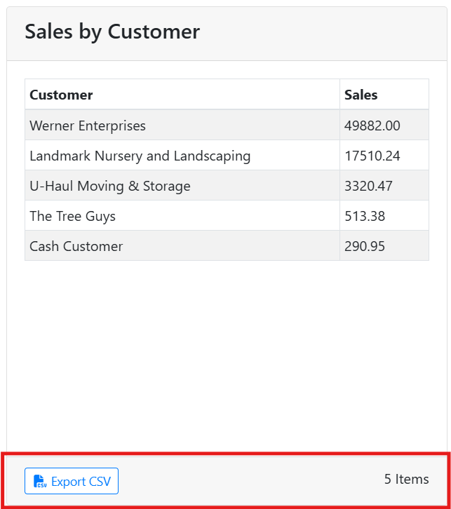
Show Footer - Displays a footer below the chart. Required if you want to enable CSV export.
Enable CSV Export - When enabled, adds a button to the chart that allows users to export the current chart contents to a CSV file. Show Footer needs to be enabled for this option to be available.
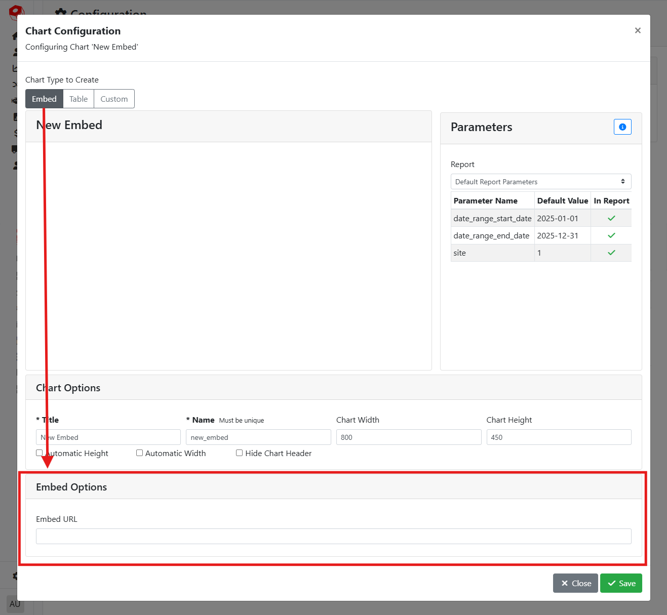
🌐 Embedding a Chart
The Embed lets you insert a chart that was created outside of ITrack. You might use this option if you’ve created a report using an external report creation tool such as Power BI or Google’s Looker Studio. Your external report needs to be a hosted webpage in order to embed it into ITrack.
With the Embed chart type, scroll down to the Embed Options box to insert the URL you want to embed.
📄 Table Charts
Making a new chart using the custom Table option requires some knowledge on how to write a SQL query and is recommended for power users only.
Tables are a style of chart that will display data from ITrack in a table, with columns and rows.
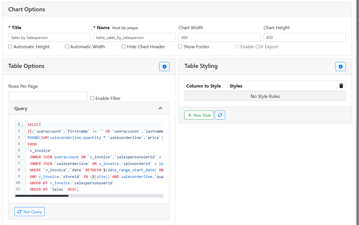
In the Table Options box, specify your SQL query in the Query box.
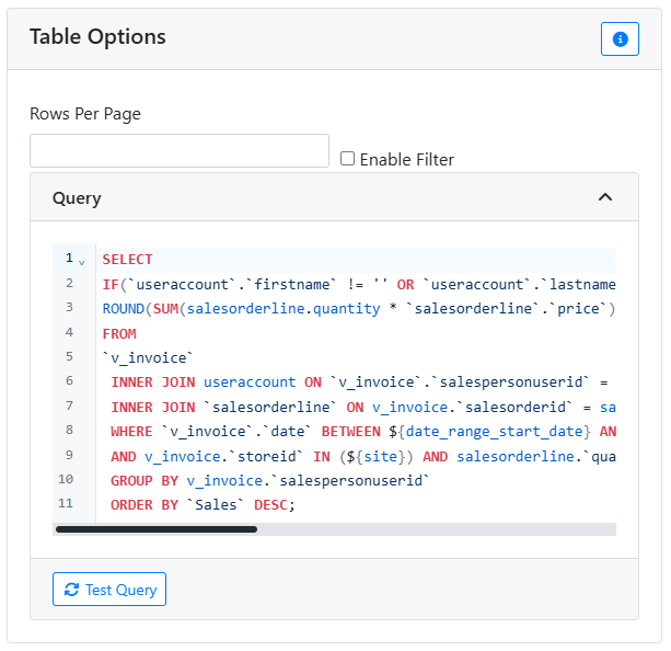
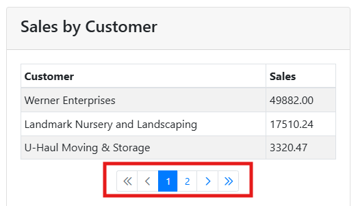
Rows Per Page allows you to set a maximum number of rows that will appear in the table before the data in the table goes to another page. When this happens, a page navigation control will appear below the table. Leaving this empty will display all rows and the table will scroll vertically.
Enable Filter adds a filter box above the table, so that you can find specific entries in the table.
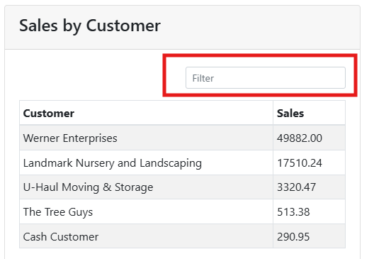
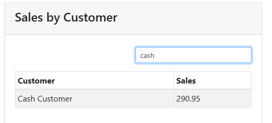
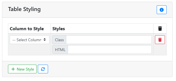
Table Styling allows you to set conditions that will cause the style of the table to change depending on certain conditions. You can style individual cells of a table based on rules specified here, per column. The Class input lets you apply styles to a cell, while the HTML input lets you override its contents.
If you just want to apply a style rule to every row in a column, such as the class table-danger, wrap it in quotation marks, e.g. "table-danger" and it will be applied to every cell in the column.
You can create more advanced style rules, such as styling a column conditionally, by writing a Math.js expression.
🎨 Custom Charts
Making a new chart using the custom Custom option requires some knowledge on how to write a SQL query and is recommended for power users only.
Custom charts are a style of chart that will display data from ITrack in some kind of a graph or drawing, depending on the Chart Type.
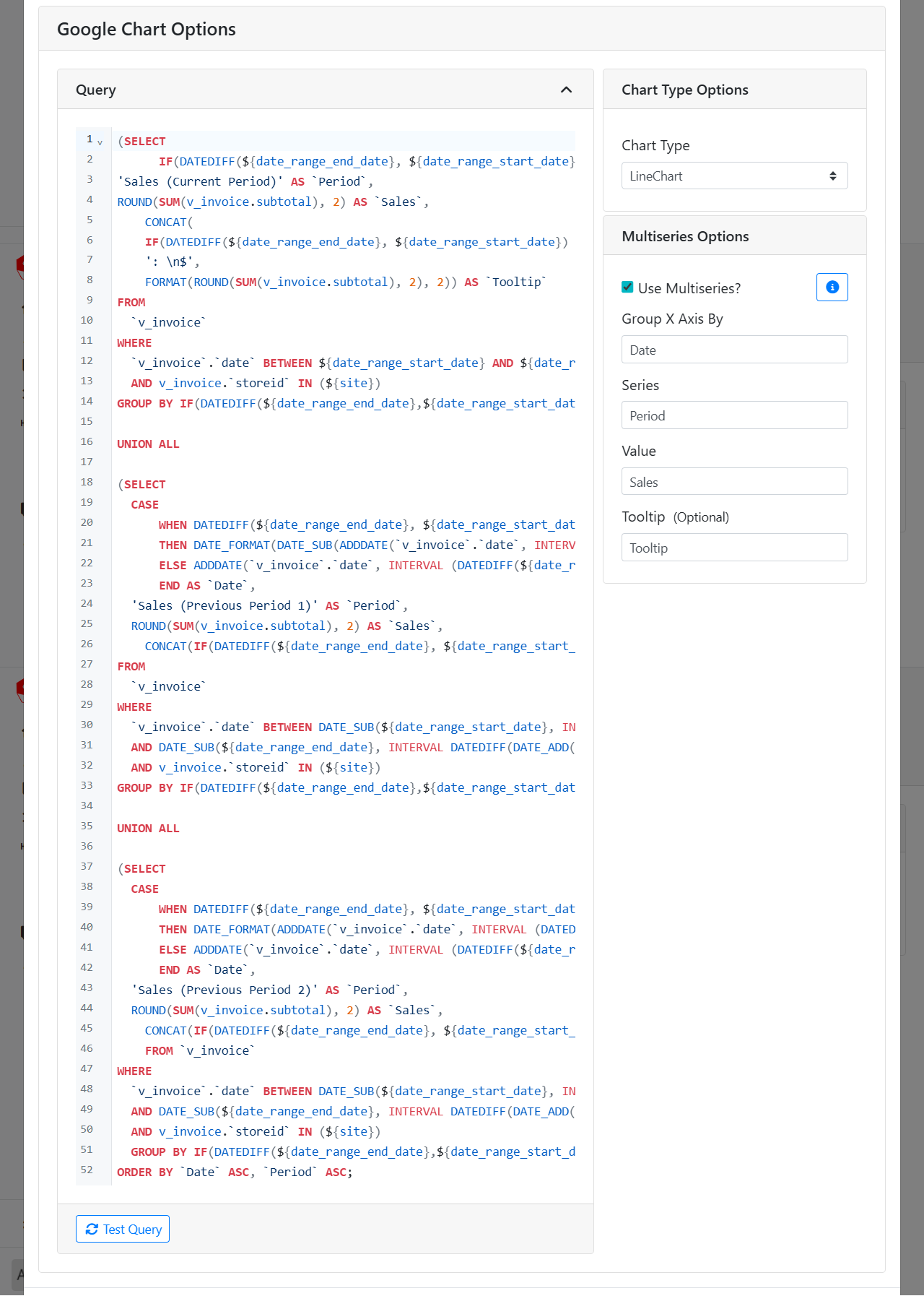
In the Query box, specify your SQL query.
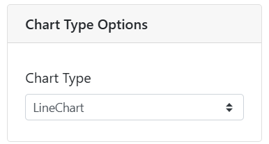
The Chart Type Options box lets you specify what type of drawing style this chart uses. There are many types available, such as Line Chart, Pie Chart, Bar Chart, etc.
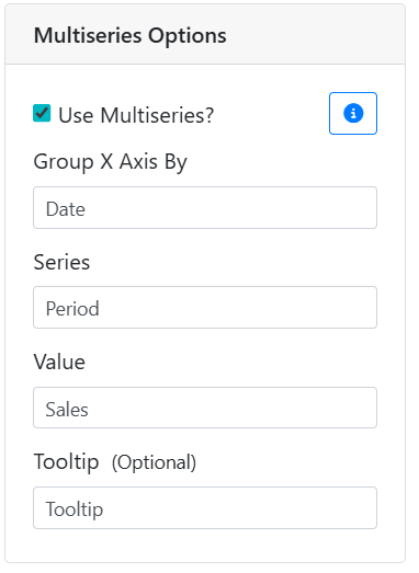
The Multiseries Options box allows you to manage settings for charts that have multiple tracked values, such as line charts with multiple lines. Not all charts need to use the multiseries feature, such as GeoCharts and TreeMaps.
In order to work, your query should be structured such that it returns three or four columns:
-
The value to group the X axis by, usually a date
-
The name of the series being graphed
-
The value to be graphed
-
Optionally, a custom tooltip for that point
Enter the name of each of those columns into the corresponding input.