The Dashboard shows you visualized charts of some of the data in your system, such as sales data.
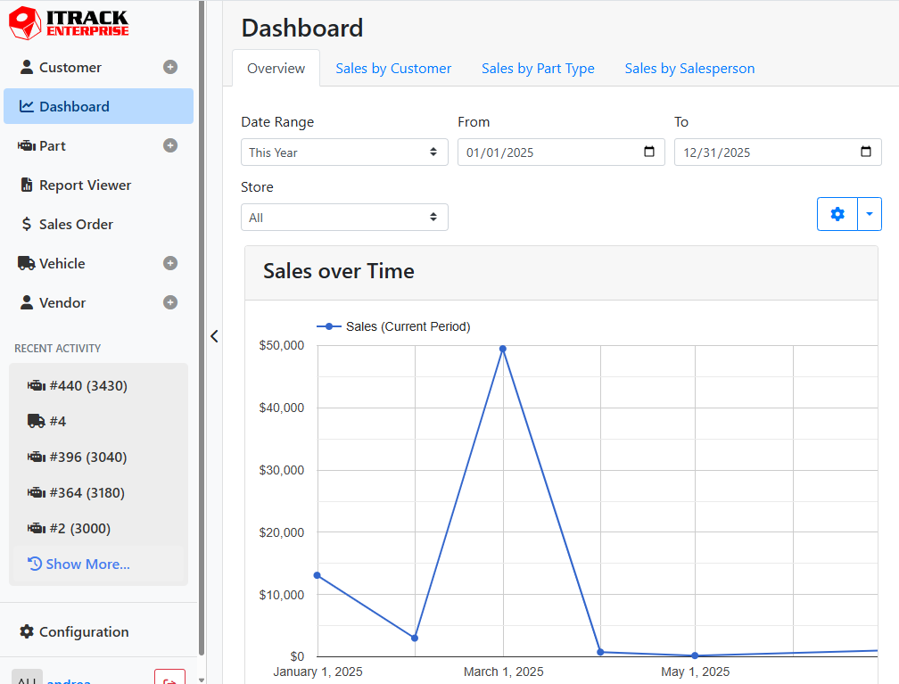
Each Dashboard report will appear on a different tab, and may consist of one or more charts. Many of the dashboard charts are interactive, meaning you can hover over points on the graphs to get more details.
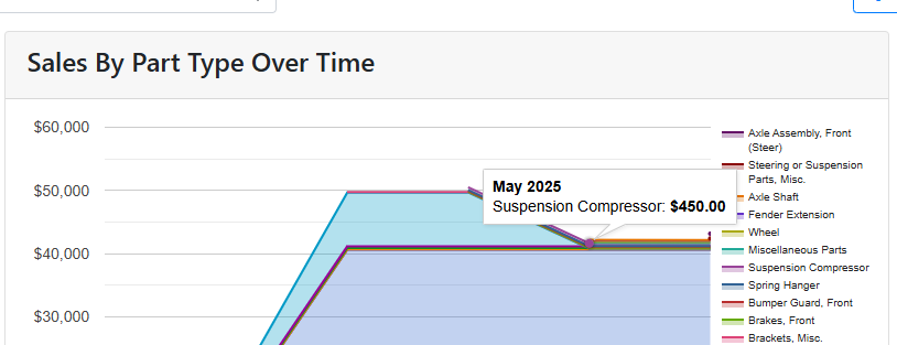
For example, in the Sales By Part Type Over Time chart, hovering over a point on the chart will show me the dollar amount and part type represented at that point in time.
Dashboard reports can be configured under Configuration > Dashboard, or by clicking the gear icon on any dashboard report.
Read more about Dashboard Configuration.